Emails designed with the email builder are responsive. This means that element sizes and layouts change depending on the screen size of the device that the email is being viewed on.
Your email is made up of sections, and each section consists of one or more columns. Within each column, you can place one or more elements, such as text blocks or images.
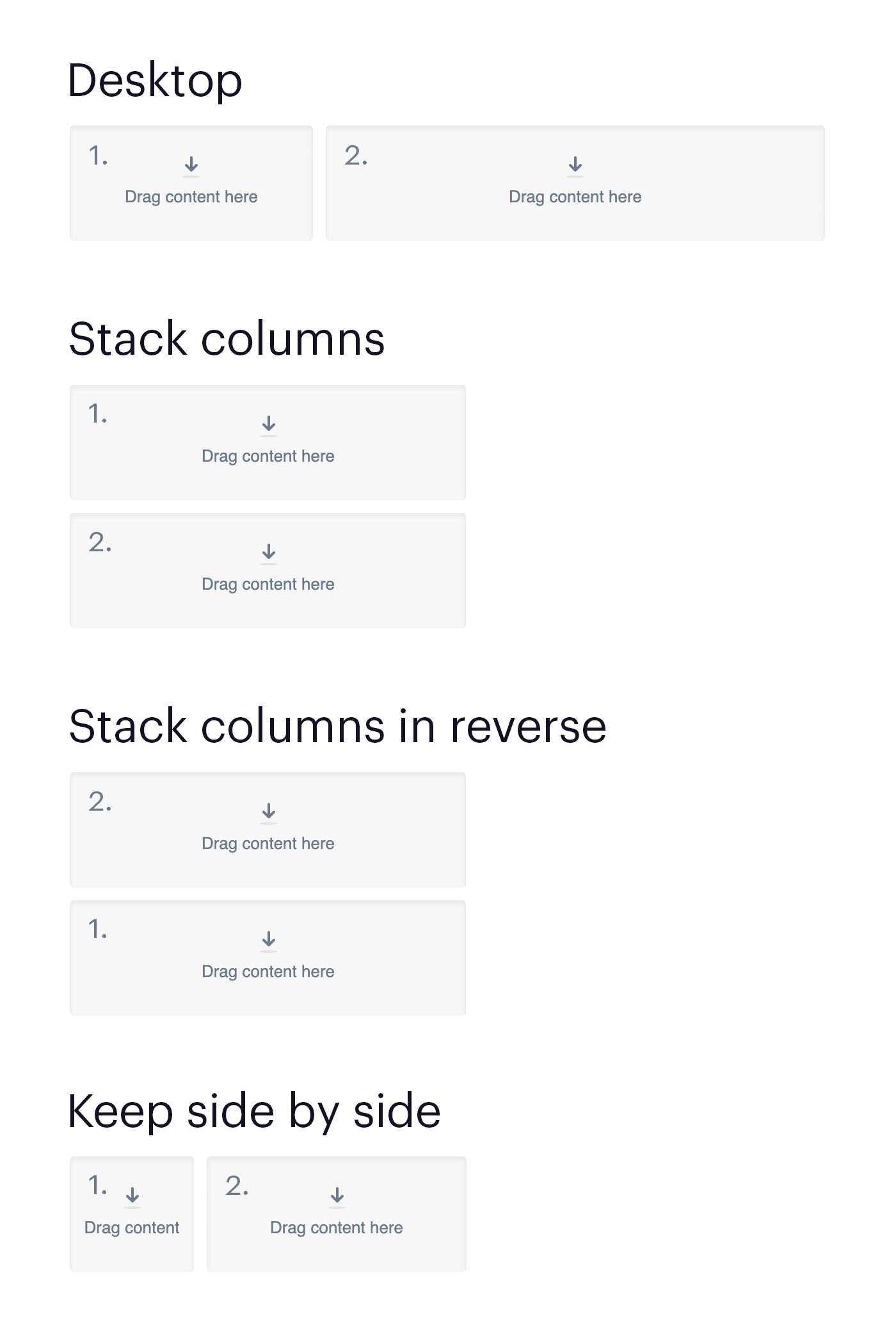
When you are designing an email on your desktop, columns will always sit side by side. On mobile, you have three choices for how to fit multi-column sections to the smaller width. To change how a section's columns appear on mobile, click to the side of a section to activate it, then click the Layout and spacing heading in the left sidebar.
You have three choices for how the column content will be displayed on mobile:
- Stack columns — Elements that are ordered left to right in the desktop version will be stacked top to bottom in the mobile version. This is the default option, and makes each column take up the same width on mobile.
- Stack columns in reverse — Elements that are ordered left to right in the desktop version will be stacked bottom to top in the mobile version. By alternating between this option and Stack columns, you can achieve a —zig-zag layout?, where the desktop view alternates between image + text and text + image, but the mobile view consistently puts the image above the text.
- Keep side by side " The columns don"t stack, but remain on the same row. Their width is reduced to fit within the mobile width, and each column takes up the same percentage of the width relative to the desktop view. Because side by side columns can be quite narrow on mobile, be mindful of long words, large font sizes, and images with small details.
Once you have chosen a mobile layout, for a particular section, you can see how it appears on a mobile device by selecting Preview on the top right side of your page.
Also test the desktop and mobile versions in email clients before sending. To do so, click Send a test email in the email builder. If you want to see how your email will look on specific email clients, use the design and spam test.
The image below shows how content is reordered for each of the three mobile options.